Dunkin’ Donuts
Environmental graphics that are simply delicious
Client:
Dunkin Donuts
Location:
Shanghai
Deliverables:
Graphic design
Wall art
The Story.
Someone must have told Dunkin’ Donuts about our creative director’s uncompromising love for sweets because when they called, asking, “Hey, wanna design something for––”, he’d already said yes.
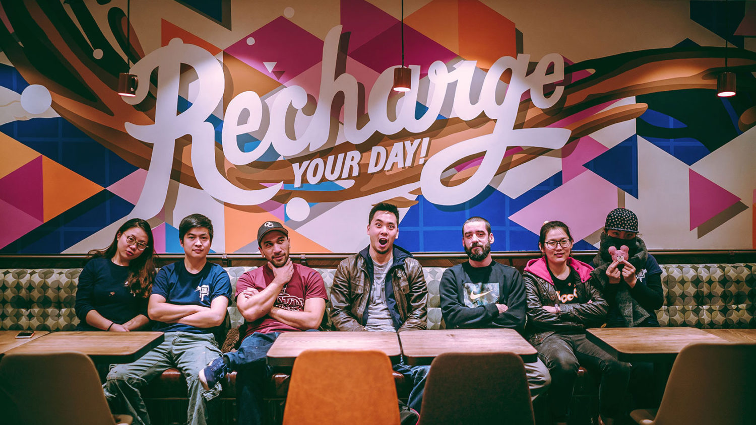
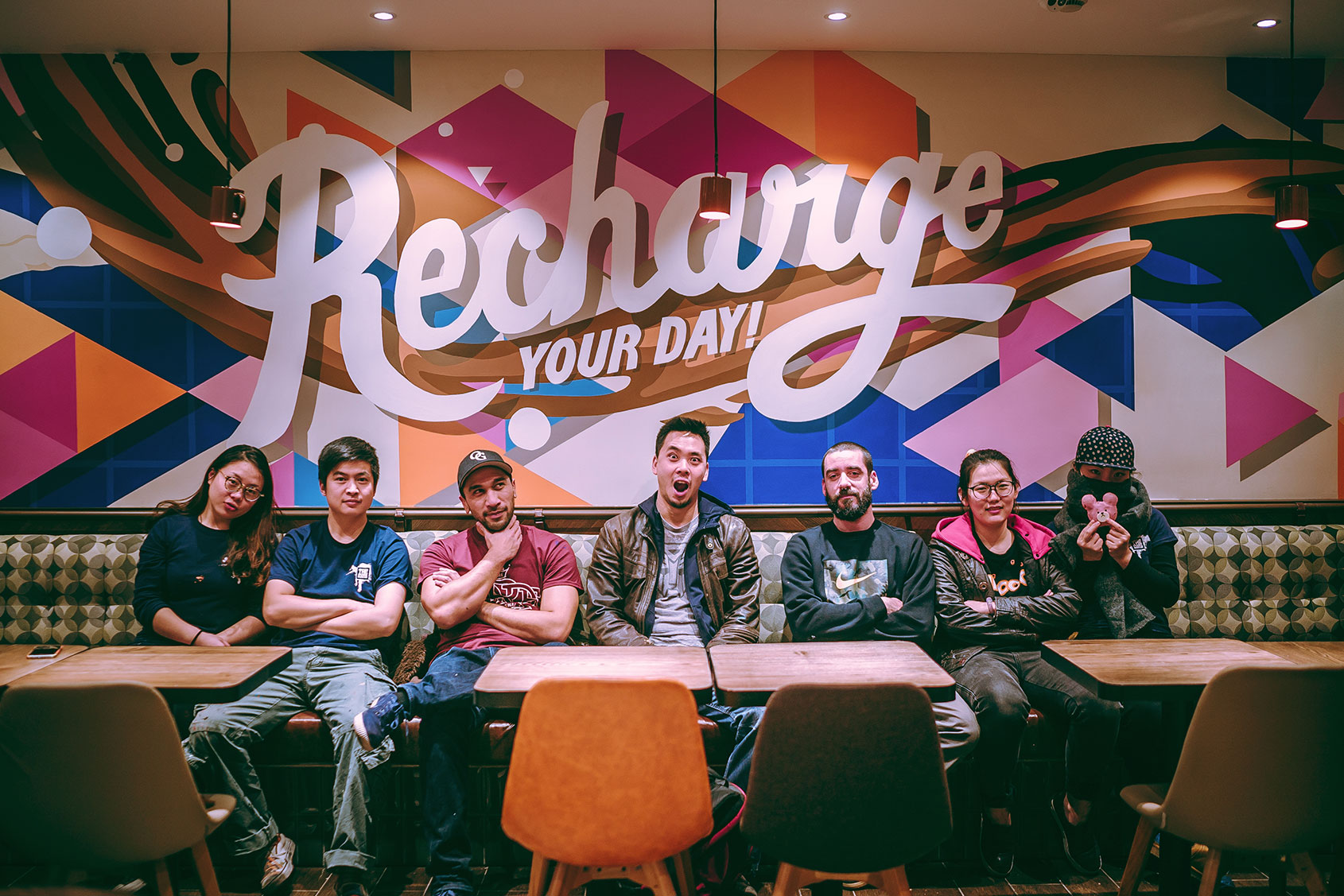
No pressure. Our job was to create a multi-storey wall art installation for Dunkin’ Donuts’ flagship store in Shanghai, taking inspiration from the brand’s existing color palette and delectable products.
With a donut in one hand and paintbrush in the other, we set off, determined to make a wall mural so upbeat, it’d almost make a cheerleader blush.
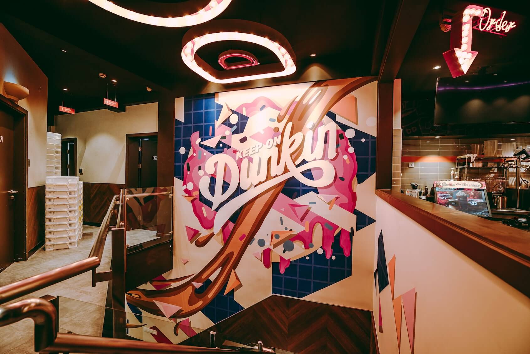
The best design is always smart, seamless, and thoughtful. Instead of creating two separate artworks for the main seating area and their 5m split-level wall, we decided on one organic piece (linking the ground to the lower level). This is so that guests flowing in and out would appreciate the interior in its entirety.
Our Solution.
The best design is always smart, seamless, and thoughtful. Instead of creating two separate artworks for the main seating area and their 5m split-level wall, we decided on one organic piece (linking the ground to the lower level). This is so that guests flowing in and out would appreciate the interior in its entirety.
Dunkin’ Donuts’ flagship store is at 1649 Nanjing West Road, Jing’an (near Réel Mall). Grab a box of original donuts, enjoy the sugary high, and tag us at #ballsdeepinpaint.


