YUESAI Cosmetics
Redesigning YUESAI’s Retail Experience
Client:
YUESAI Cosmetics
Location:
Shanghai
Deliverables:
Brand Experience
Creative Strategy & Consulting
Digital
Environmental Graphic Design (EGD)
Interior Design
Packaging
Signage
Wall Art
The Story.
The year was 1992. Madame Yue-sai Kan, an Emmy-winning TV host and entrepreneur started her own beauty brand, “YUESAI” specially for Chinese women, using Chinese Traditional Medicine (TCM) augmented by science.
In 2004, L’Oreal Group acquired YUESAI Cosmetics. Its challenge: How to reposition the brand USP to remain relevant for the next generation of women leaders?
With the need to attract a new generation of customers, and boost foot traffic to its flagship store in New World, Shanghai, YUESAI engaged TOBF to develop a creative strategy to enhance its overall in-store retail experience.
Our Solution.
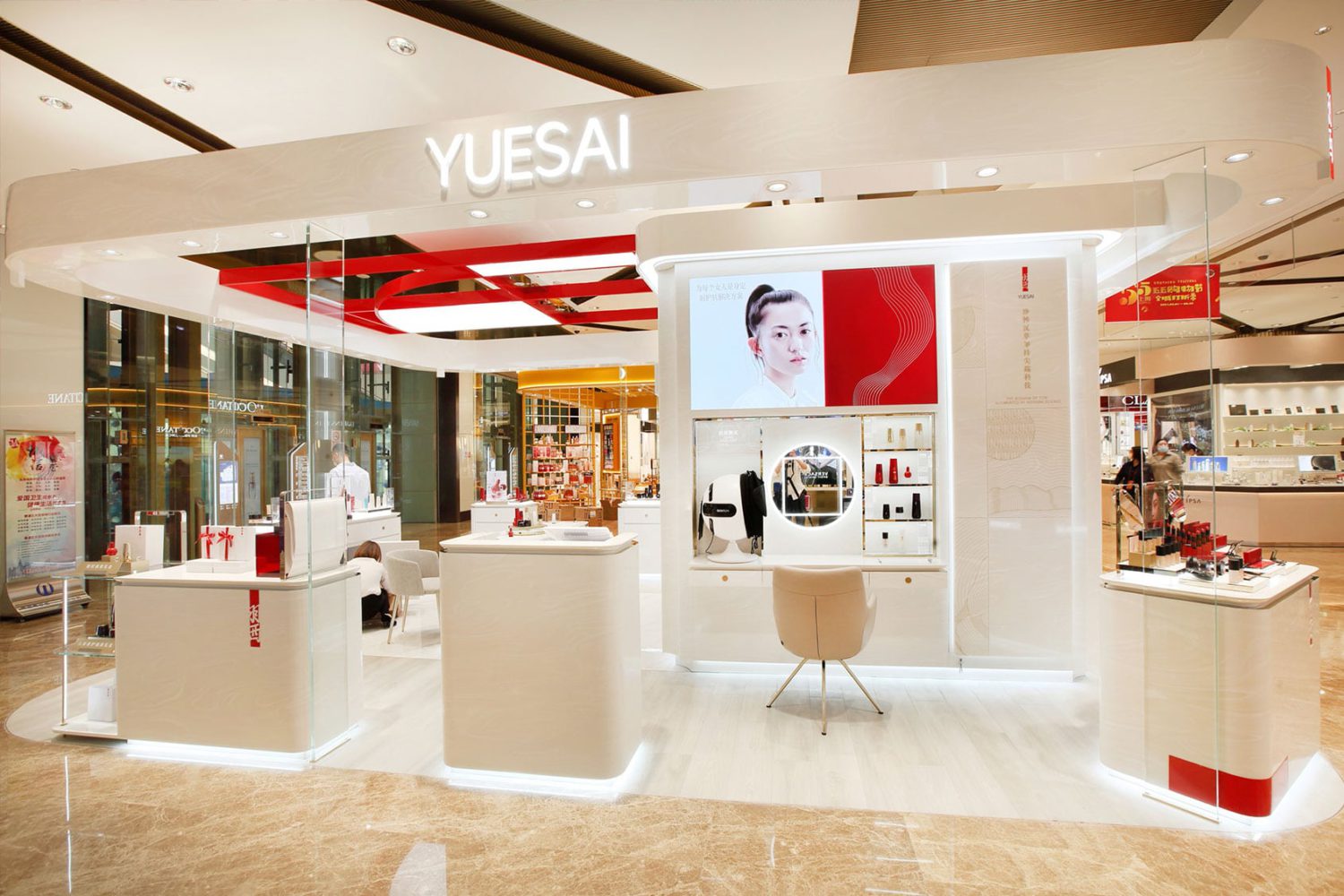
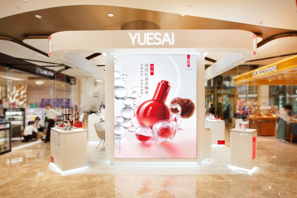
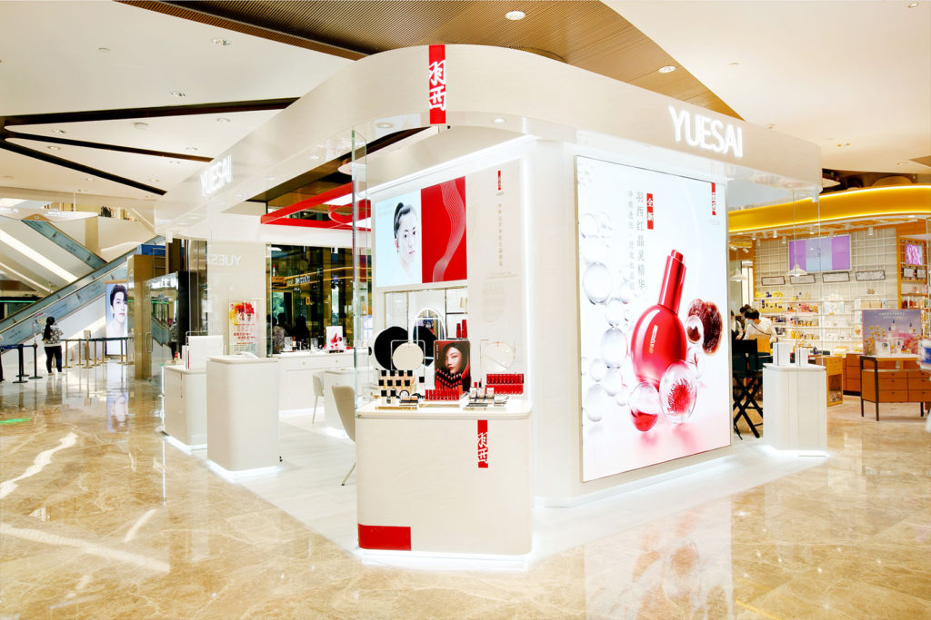
YUESAI’s flagship counter is based in a department mall, with high traffic and fierce competition around. From our research, we found that there are three points of entry where people would fall in the vicinity of YUESAI’s retail store. In our redesign process, we considered these entry points and focused on prime visual spot for each zone: (a) From Afar, (b) Perimeter and (c) Up Close.
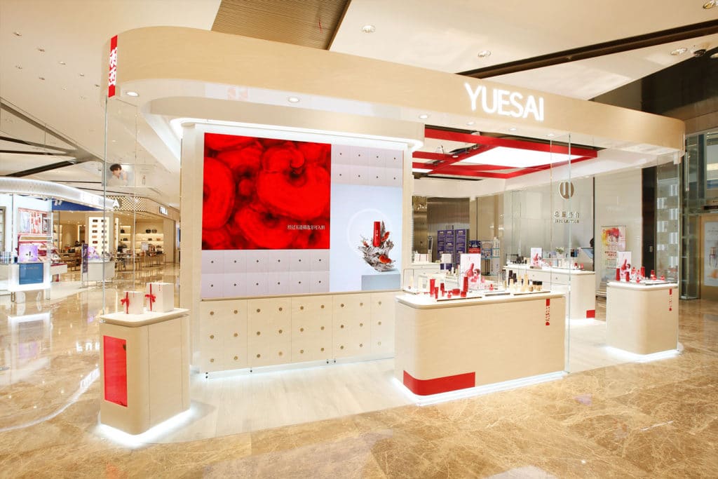
From afar, we stripped away all heavy applications of red from the counter design limiting to selective elements such as the YUESAI logo and perimeter highlights. Red was also reserved for spotlighting brand hero items such as countertop products and YUESAI’s promotional video – which was displayed on a large screen – easy to spot from far.
Within the perimeter, we drew customers closer to the borders with our second area of focus: a modern Chinese Medicine Cabinet, with infinite drawers, to wrap around the central column of the store. This cabinet served as inspiration for our engagement solutions. Using white marble as the drawer’s primary colors, we layered a marble stone finish across its surrounding walls for an elegant touch, invoking a sense of purity and how luxury beauty feels when imagined on the skin.
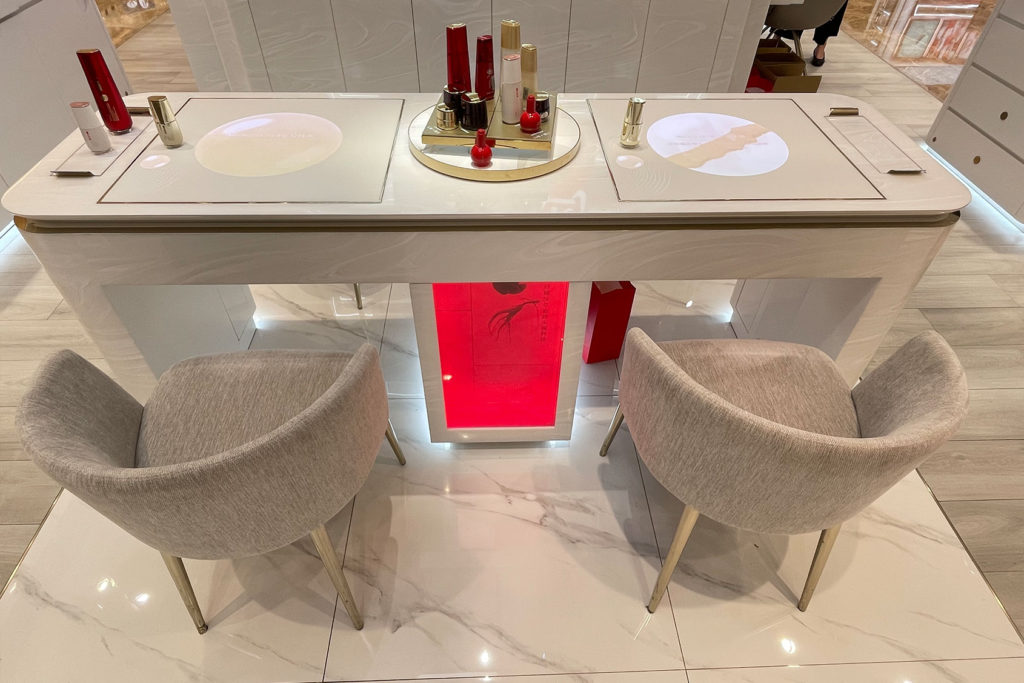
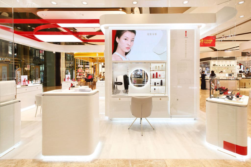
Up Close, and in the final zone was the Customer Experience Area. We leveraged this innermost space and introduced the most tactile and personal solutions so that beauty advisors could further enhance customer experience. Using technology as a medium for engagement, we integrated a sensor touch pad on YUESAI’s counter spaces. Here customers could discover more about any brand product, just by placing it on top of the table. The sensor would detect which product it was, thereby revealing its accompanying details, as well as customer reviews, and links for customers to further explore YUESAI’s products.
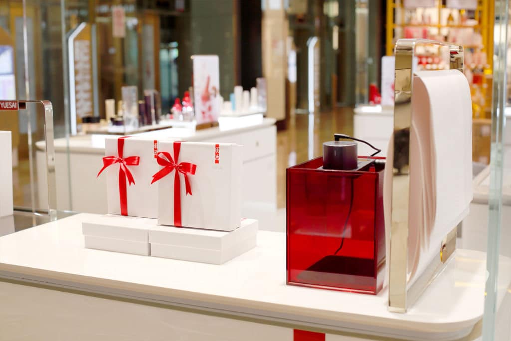
Lastly, to add on that personal touch, we integrated our abstract interpretations of TCM ingredients not only in the retail space design, but also in YUESAI’s customized gift-wrapping when purchasing gifts for friends and families.
The Results.
According to the general manager of YUESAI Cosmetics China, “The Orangeblowfish’s creative ideas and what they have designed for YUESAI has completely blown us away. Their ability to come up with out-of-the-box creative ideas and translate them into innovative solutions that are on-trend and relevant to the market, is what YUESAI needs to reinforce our leadership position in the beauty industry in China.”

