Designing sustainable pop-up stores for lululemon
Design solutions that are evergreen, long-lasting, and flexible.
Client:
lululemon
Deliverables:
- Interior Design
- Environmental Graphic Design
- Brand Experience
The Story.
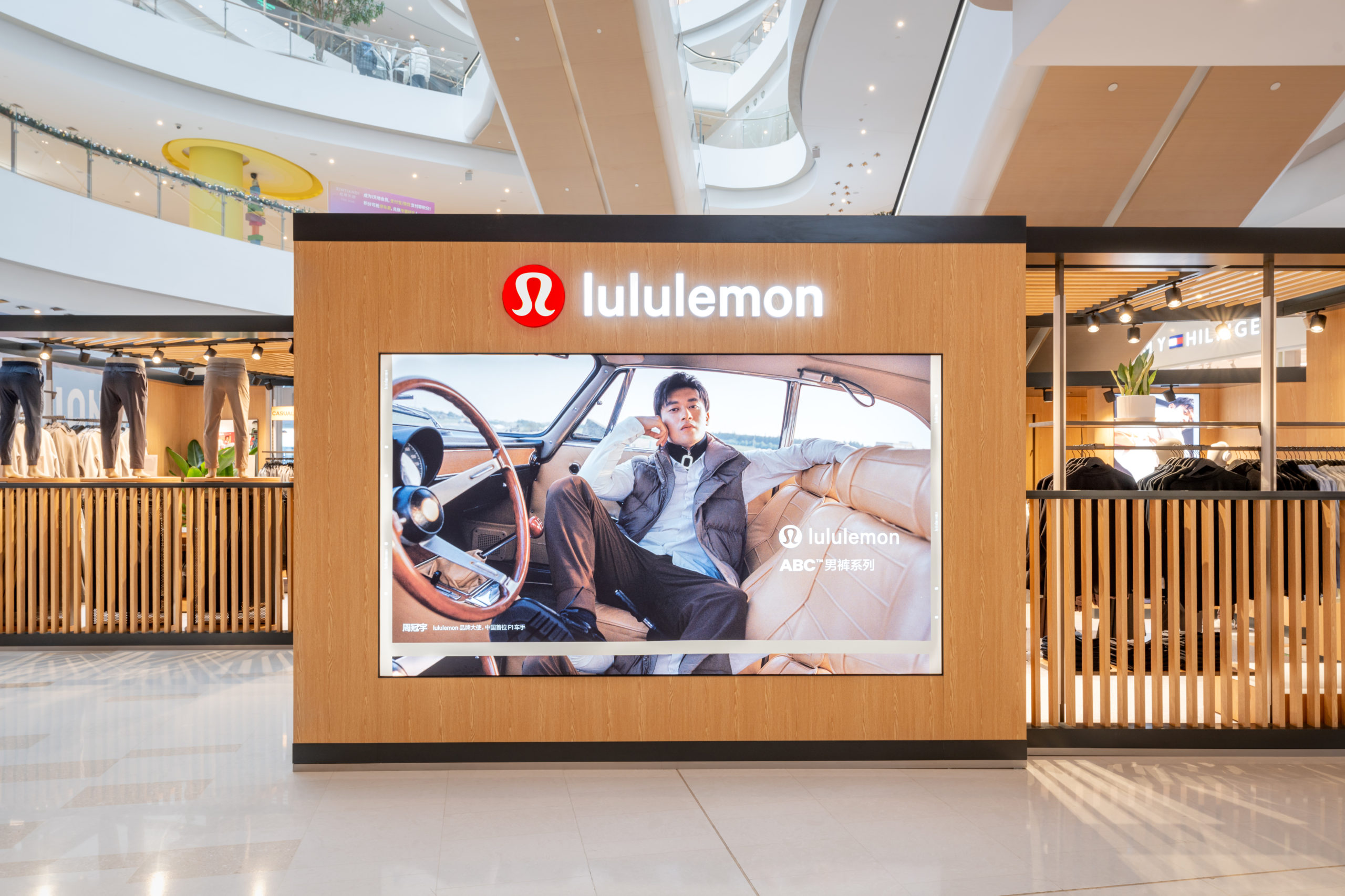
In December 2023, lululemon partnered with The Orangeblowfish to open their first menswear pop-up store at The HUB, a vibrant shopping centre in Shanghai’s Hongqiao district. This was lululemon’s first space dedicated entirely to a men’s clothing line in the city, aimed at both sales and market trials.
Our partnership with lululemon started in 2018 with the murals and installations we created for their Shanghai Taikoo Hui store. By 2023, our creative synergy had blossomed further, fully redefining pop-up space design.
Our Solution.
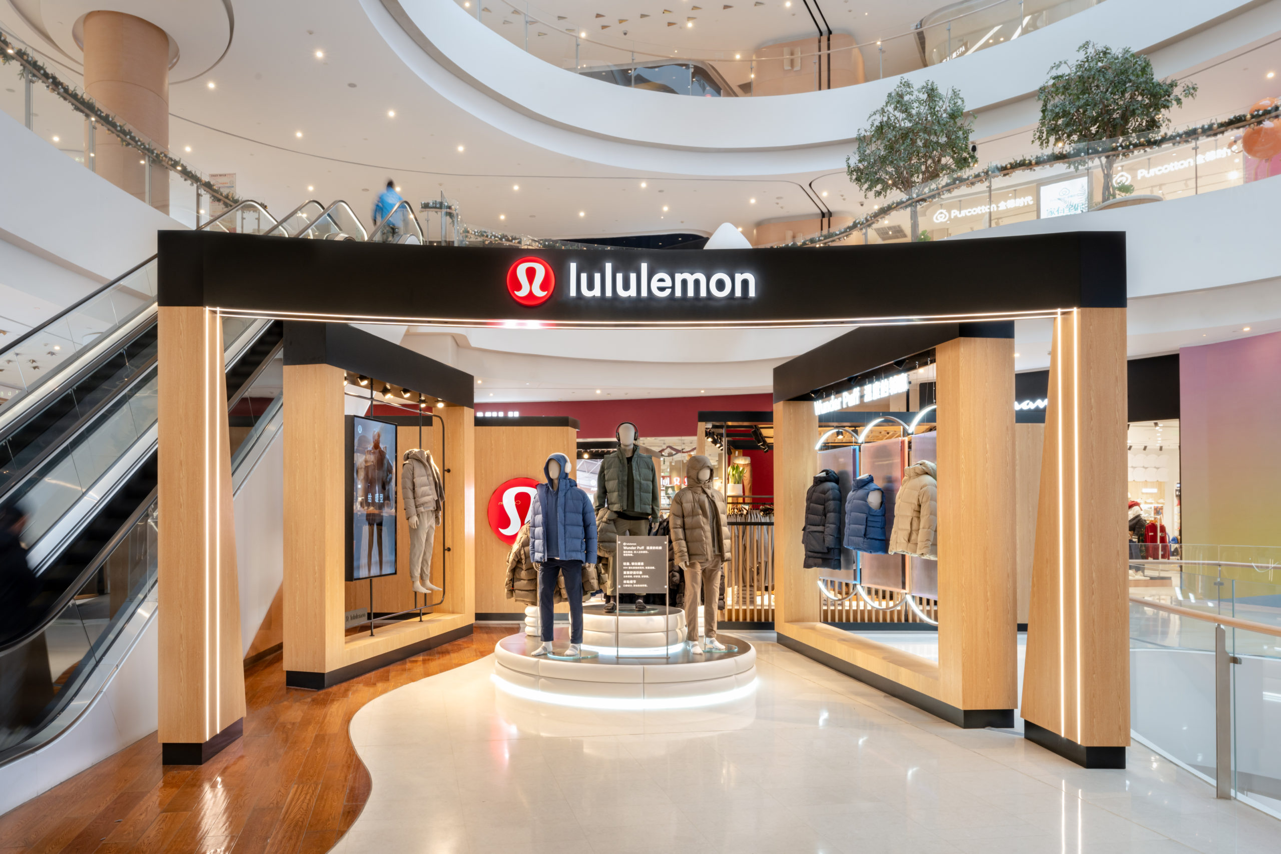
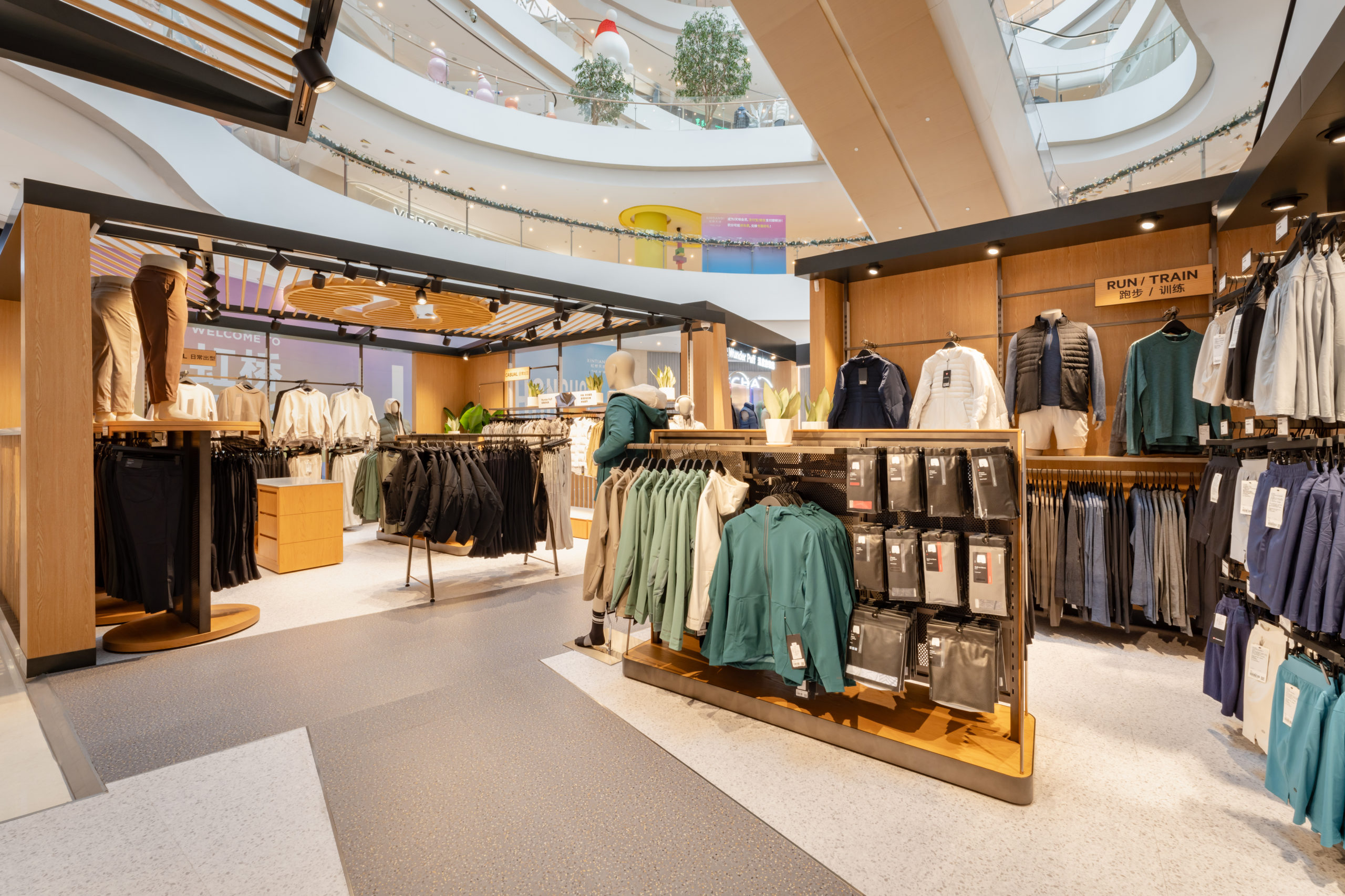
We created a pop-up that conveyed lululemon’s ethos, leveraging the versatility and multipurpose aspects of their collections. In addition, we took into consideration the strengths and uniqueness of lululemon’s menswear to design a completely new layout. This is a departure from what’s seen in sports and menswear retail.
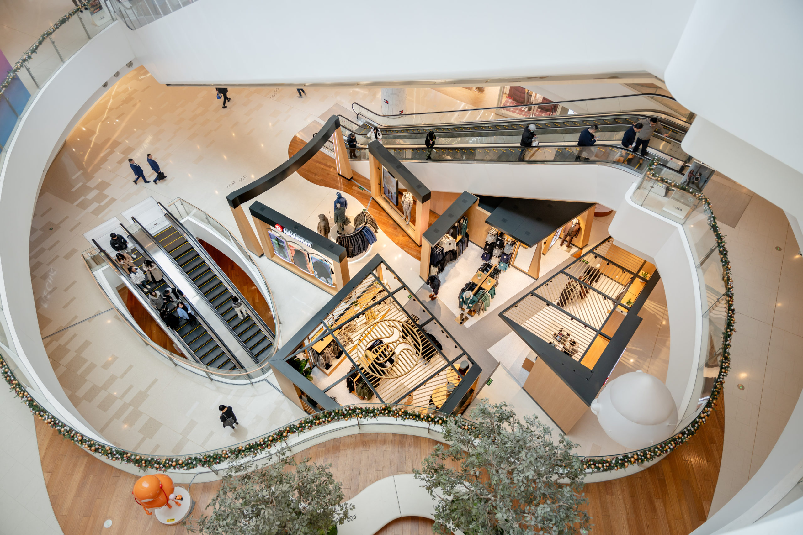
Drawing from the brand’s commitment to sustainability, we developed a modular retail design that could be disassembled and reassembled — just like a Rubik’s cube. You guessed it! We named our design solution, ‘The Cube’.
The Cube is a new and sustainable approach to pop-up stores. It is a structure that easily transforms itself and creates different zones. Even after pop-up periods end, its components can be repurposed.
With lululemon’s Cube, each space worked both independently and combined. Each module boasted a specific theme and there were no rigid barriers. The open layout ensured the free flow of visitors in the interior and a clear display of products to the passersby.
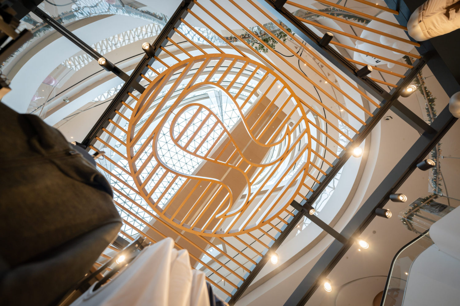
We carefully blended lululemon’s iconic logo with our choice of material for the space and incorporated it in various forms, including a hollow design on the roof. These details elegantly reflect lululemon’s commitment to craftsmanship and quality.
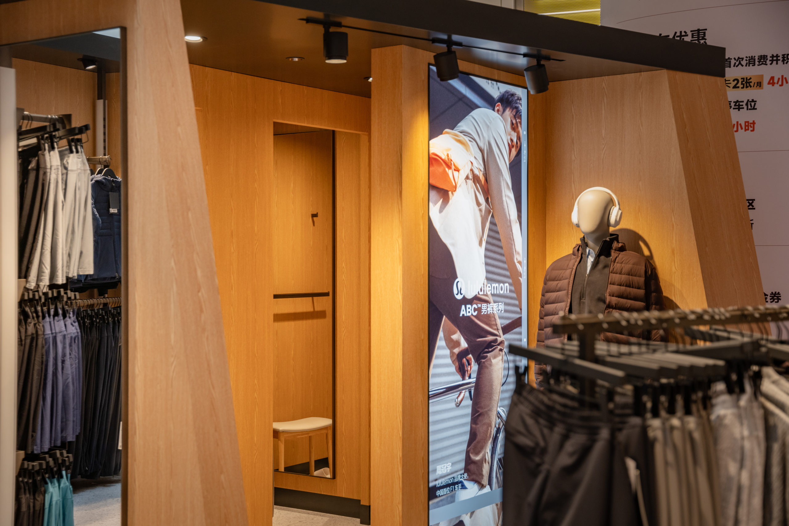
The layout did not exclude essential retail functionalities, like fitting rooms and a cashier area — we wanted The Cube to be fully functional.
The Results
We avoided the common waste of materials associated with short-term pop-up stores. Our pop-up design was rooted in sustainable values, and it also worked for the audience at large. Visitors could seamlessly flow through an intuitive layout with various displays and island counters, while exploring different product categories.
The result of this project with lululemon was a pop-up structure that is evergreen and long-lasting. It is flexible enough to be used repeatedly and in fresh and engaging ways.

